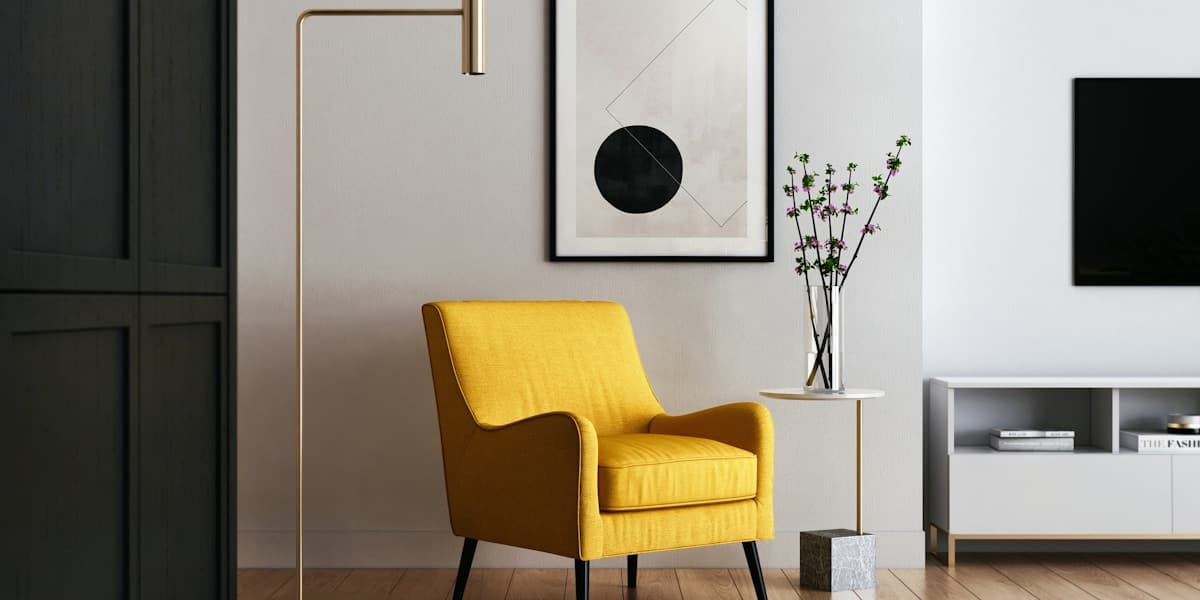
The most convincing gallery wall I’ve measured was in a 3.4 m × 4.2 m front room in a Victorian terrace in Walthamstow, with a 56 cm-deep chimney breast, a bay window throwing light from the left, and a radiator sulking under the sill. The owner had nine prints, none from the same set, plus one slightly wonky school photo from 2017. It should have looked a faff. It didn’t, because every frame obeyed the same centre line. My thesis is blunt: a gallery wall looks busy when frame centres wander; keep one repeated datum line or grid module and you can mix art styles without the wall shouting.
What we're working with
Most UK rooms don’t give you a clean museum wall. In a terrace front room, the sofa is often pushed against the long wall because the chimney breast steals the obvious TV spot. In a 1930s semi, the alcove might be 92 cm wide on one side and 118 cm on the other, which is just enough asymmetry to make a casual gallery wall look accidental. Post-war flats bring concrete walls, picture rails at odd heights, and rented flat anxiety about deposits. Then there’s the everyday stuff: a BS 1363 double socket halfway up the chimney breast because someone once wall-mounted a telly, a door swing taking 78 cm out of the corner, kids’ toy storage below, and a cable run you can’t chase because the plaster is more patch than wall.
The paper template method is the grown-up answer. Use brown parcel paper or printer sheets taped together, mark the frame outline, then mark the hanger point, not just the top edge. A cheap A3 frame can be £14.99, a decent oak-effect A2 frame can be £28.00, and the glass or acrylic catches light differently, so test in daytime before you commit. Adhesive strips are handy, but on crumbly lime plaster they can let go. Proper hooks are less glamorous and more trustworthy.
Layout 1: a calm 3 × 3 grid above a sofa
The goal is a strict grid above a 200 cm sofa, with every frame doing the same job.
This is the safest of the gallery wall layout ideas because it removes almost every judgement call. The total grid is 106 cm wide and 136 cm high if the frames are portrait. That gives enough presence above a two-seater without creeping into the ceiling line. In a new-build lounge with a 2.4 m ceiling, keep the top of the grid below 205 cm from the floor; higher than that and the top row starts to feel detached from the seating area.
The trick is to hang the centre frame first. Mark its centre at about 145 cm from the floor if the sofa is low, or 150 cm if the sofa back is chunky. Then build outwards using spacers cut from cardboard at 8 cm. The trade-off is obvious: a grid exposes cheap frames. If one corner bows or the mount is 3 mm off, you’ll see it. It also prefers related art: black-and-white photos, similar mounts, or prints with plenty of white space. The content can vary, but the frame size must not.
Layout 2: a single datum line over a sideboard
The goal is a relaxed wall that still reads straight, using one shared horizontal centre line.
This is the one I’d use in a dining room, a hallway landing, or above a 120 cm sideboard where a perfect grid feels too office-like. The shared centre line does the hard work. You can have portrait, landscape and square frames, but their centres all sit on the same invisible rail. It’s a good fit for 1930s semis because those rooms often have a picture rail or a dado line already telling your eye where the horizontal wants to be.
Leave at least 15 cm between the sideboard top and the lowest frame. If you use the sideboard for post, keys and the council recycling letters no one has dealt with, make that 20 cm. The width wants to be about two-thirds to three-quarters of the furniture below, so a 120 cm sideboard takes a gallery span of 80 cm to 95 cm. Push it wider and it starts to look as if the furniture is holding up the wall. Keep the central frame calm; that’s your anchor. If that middle piece is loud, everything around it has to whisper.
Layout 3: symmetrical stacks either side of a chimney breast
The goal is to use narrow alcoves without making the chimney breast look cluttered.
Victorian terraces often tempt people into putting one big gallery wall across the chimney breast. It rarely works if there’s already a TV, mirror, stove or mantelpiece there. The better move is to let the chimney breast breathe and put matching stacks in the alcoves. If the left alcove is 96 cm wide and the right is 104 cm, don’t panic. Align each stack to the outer shelf edge or cupboard edge below, rather than trying to centre both stacks on unequal plaster.
The measurement that matters is the starting height. Put the top of the first frame at the same height in both alcoves, ideally 125 cm to 135 cm from the floor if you’re working above low cupboards. Keep the bottom frame at least 12 cm above lamps, vases or speakers. This layout suits family photos because symmetry makes sentimental pictures feel less chaotic. The caveat: if one alcove has a tall floor lamp or a 1.8 m plant, the paired stacks can look lopsided. In that case, drop to a single stack on the quieter side and use the other alcove for height.
Layout 4: a stair gallery with paper templates
The goal is a staircase gallery that follows the pitch without turning into a diagonal mess.
Stair walls are where gallery walls go dodgy. Narrow stairs in a terrace can be 78 cm wide, so you’re viewing the frames close-up and at an angle while carrying washing or half a toolbox. A normal eye-level measurement from the landing floor won’t work. Measure from each stair nosing instead, then tape a sloping string line at 155 cm. Every frame centre touches that line.
Paper templates are non-negotiable here. Cut each template to size, mark the hanger point, then blue-tack the whole run before making holes. Live with it for a day. You’ll spot the frame that catches your shoulder at 8:15 during the school run. Keep deeper box frames off the stairs; 3 cm depth is about as much as I’d risk on a tight flight. In rented flats, removable strips can be tempting, but stair temperature changes and old paint make them unreliable. If you can’t drill, use fewer lightweight frames and accept that this is a temporary version.
The counterargument: loose salon walls have life
The best argument against all this measuring is that old houses aren’t straight and art shouldn’t look like a spreadsheet. A loose salon wall, built over years, can have more personality than a grid bought in one Saturday afternoon. I agree with that in rooms with high ceilings, deep skirting and enough blank wall for the eye to rest. A Bloomsbury-ish jumble can look brilliant over a battered leather chair.
But most busy gallery walls aren’t charmingly collected; they’re under-planned. The frames are too close to the light switch, the top line collides with the curtain pole, and the tiny print from a holiday market is asked to carry the same weight as an A1 poster. Structure doesn’t kill character. It gives it somewhere to sit. Use one rule only: a grid, a centre line, mirrored stacks, or a stair pitch. Then let the pictures be human.
Common mistakes
The first mistake is centring the gallery on the whole wall when the furniture below is off-centre. In a terrace lounge, the sofa may be shifted 20 cm away from the radiator or door swing; centre the frames on the sofa or the grouping will look mildly wrong forever. The second is ignoring sockets and switches. A white BS 1363 socket cutting into the bottom corner of a gallery wall pulls the eye more than people expect, so either leave 10 cm clearance or make the lowest row sit well above it.
The third mistake is using identical gaps between wildly different frame sizes without a bigger organising line. A 6 cm gap can look neat in a grid and fussy in a mixed wall. The fourth is hanging too high above beds and sofas. Keep the lowest frame 18 cm to 25 cm above the furniture; any more and the gallery floats off like a thought bubble. Cheap acrylic glazing can also bow and reflect ceiling spots, so test before hanging nine of them in a row.
FAQs
What is the easiest gallery wall layout for a small UK living room?
A 3 × 3 grid is the easiest gallery wall layout for a small UK living room because it controls the spacing and keeps the wall calm. Use matching 30 cm × 40 cm frames with 8 cm gaps, centred on the sofa rather than the whole wall.
How far apart should pictures be in a gallery wall?
Most gallery walls look best with 6 cm to 9 cm between frames. Use the smaller end for a tidy grid and the wider end for mixed frame sizes, especially in rooms with patterned rugs or open shelving nearby.
Can I make a gallery wall in a rented flat without drilling?
Yes, you can make a gallery wall in a rented flat without drilling if the frames are light and the paint is sound. Use removable strips rated for the frame weight, but avoid heavy glass frames and be wary of old plaster or flaky emulsion.
Should all frames match in a gallery wall?
Frames do not all need to match, but one thing must repeat. Repeat the frame colour, mount colour, centre line or spacing; without one repeated rule, the wall usually looks busy rather than collected.
How do I stop a gallery wall looking cluttered?
Stop a gallery wall looking cluttered by choosing one layout rule before you hang anything. A grid, a shared centre line or symmetrical stacks will calm mixed prints, family photos and different frame sizes.